Time for a Rebrand
After going on blog sabbatical, I was ready to return with something new that matched some fresh energy.
I took a break from posting for awhile, but my reasons for sewing and creating useful blog content are still the same.
Here are some thoughts that went into rebranding.
Website Colors
My old website color was gray. I loved how simple and clean it was — the same color as this font, which I kept the same. Simple and clean are enduring elements in my work, so it was a good expression of that ethos at the time.
The older I get the more I appreciate femininity. Growing up I only wanted to wear cutoff jean shorts because they were the best for climbing trees and ropes.
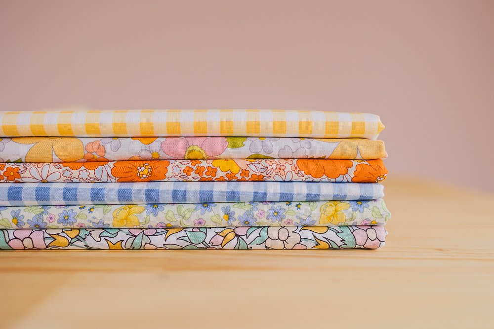
But now you can actually find me wearing floral dresses and painting my sewing room a dusty apple blossom color. And this dusty apple blossom feels like the perfectly fresh tone for this space right now. Isn’t it lovely?
Font Colors
At first I was thinking the new website color would be orange. The gentleness of this dusty pink just felt right though, so it wasn’t a hard decision once I compared the two. But I also love orange with pink. So now I have some orange font headers.
Photo Colors
Some blogs have nicely matching photo colors and backgrounds for each tutorial. It’s an appealing idea to make the whole website cohesive. I, however, am someone who gets bored of doing the same thing.
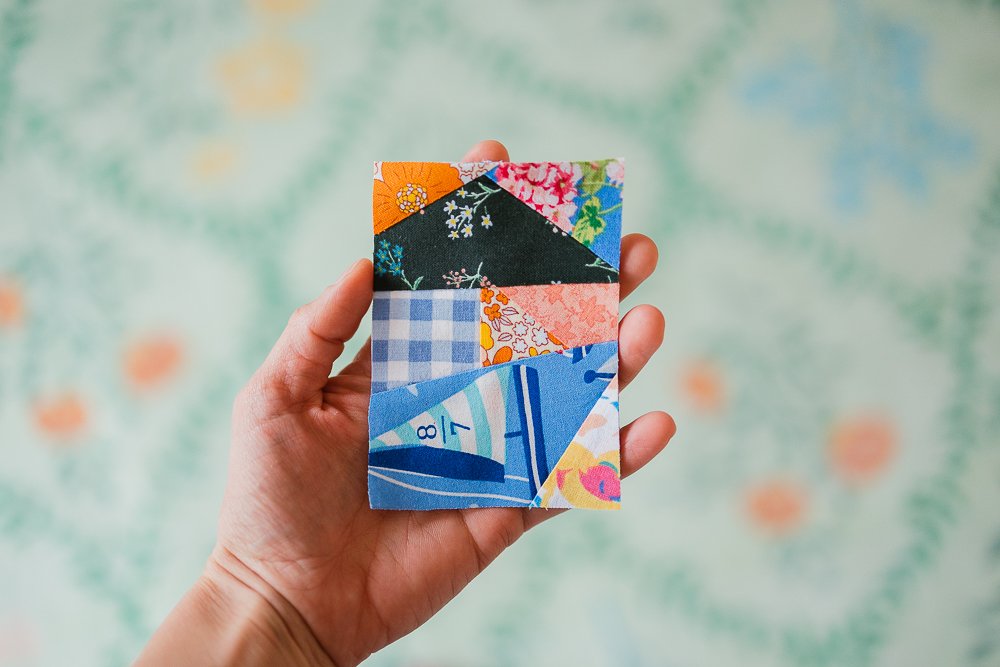
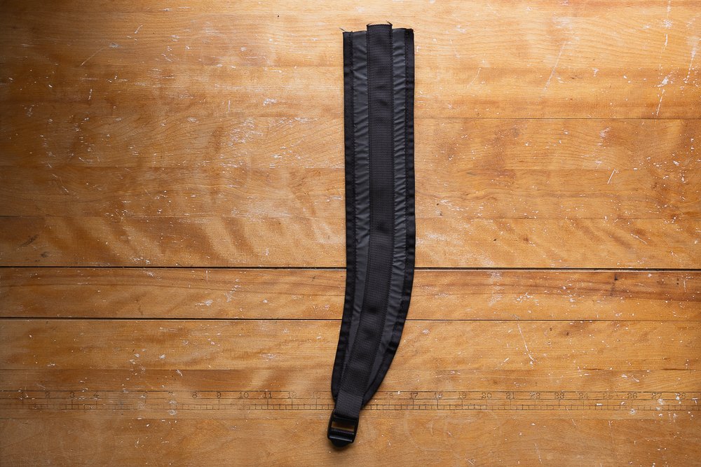
I decided to move ahead without feeling the need to have every photo match throughout the website. Then pretty quickly I realized mismatched photos were actually a key to making it fun for me to take and post photographs on the blog. If I feel trapped into editing all the photos a specific way or only taking photos in certain rooms of my house, it wouldn’t be nearly as fun.
My hope is that even though the photos have different characteristics, they feel cohesive because they come from the same creator.
Photo Character
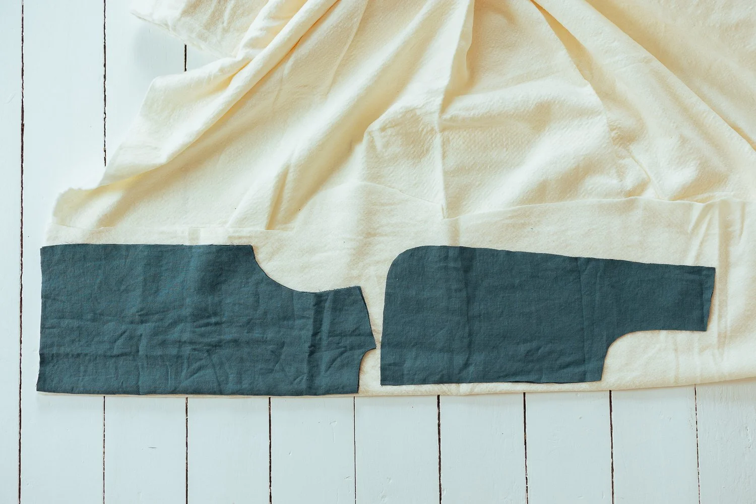
Should the fabric be neatly ironed or cozily wrinkled? Should the background be smooth or have shadows and floorboard cracks? Should the photos be simple and clean or cluttered and detailed? Should there be illustrations and photos or just photos? How much character should the photos have?
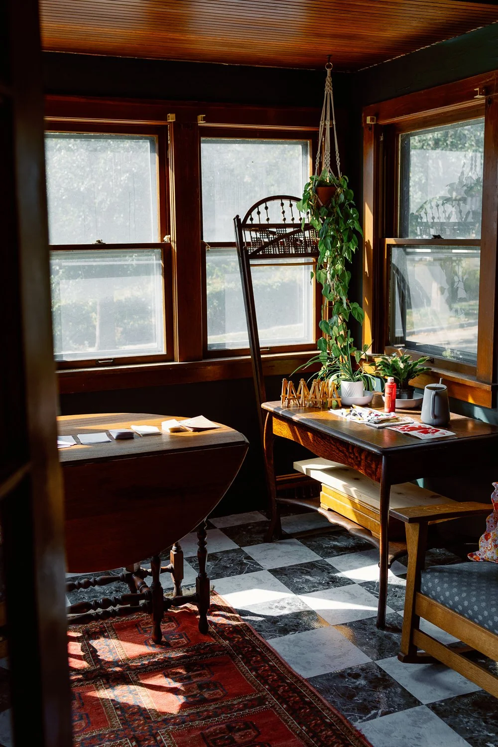
My house contains all of these things, and I enjoy each room for its own character. I enjoy wrinkled fabric and ironed fabric. I enjoy photographs and illustrations. I decided to say yes to all of it.
Self Portraits
At this stage in life, I’m not particularly drawn to posting photos of myself. I love seeing photos of people who own the blogs I read and the patterns I buy. It’s compelling to see someone. I feel more restful spending time on their website if I know what they look like for some reason. It makes me feel like I know them a little bit more.
Since I’m not feeling compelled to post many self portraits though, I decided to be okay with that for now. Maybe I’ll grow into it slowly.
It helps when I happen to take some photos I enjoy. For reference, and in effort to grow comfortable with self portraits again, here’s what my living room and I are looking like these days.
Blog Topics
I love sewing and I love photographing. In thinking it over, I decided it was okay to publish both sewing tutorials and sewing photographs in various posts. I hope you enjoy that, too!
So far I’ve decided to keep the overall topic mostly on sewing expressed in a variety of ways, but sometimes I toy with including other fun, useful, or interesting craft projects.
Thank youuuuu
For reading my blog, following my tutorials, buying my patterns, and sending lovely emails my way, thank you. I’m grateful, so grateful to be doing this. Thanks to you, I’ve been designing and selling patterns for over 7 years. Thank you for being here.
If you’d ever like to get in touch, feel free to send me a note.
If you enjoyed this post, you may also enjoy…
Here’s why I sew.
Photos of different sizes and placements of pockets.
Step by step video tutorial.


